How do you earn a user's attention when they have other ten tabs open?
Scribd is a global SaaS document platform with 1.8M+ subscribers. I led the redesign of the document page to balance monetization and trust through a scalable layout.
Duration: Jan–May 2024 · Team: 2 Product Designers · UX Researcher · Product Manager · Lead Engineer
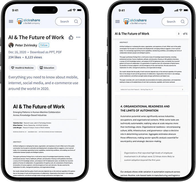
The doc page was difficult to scan and even harder to focus on.
The typical session is a fast scan: is this relevant, is it credible, is it worth the time? The layout made that harder than it needed to be: the document started too far down and metadata disappeared on scroll. For non-subscribers, ads added friction on top of all of it.
Finding out whether persistent metadata actually changed how people read.
I ran a user testing session to find out whether keeping title, author, ratings, and actions visible helped users multitask and stay oriented without losing their place.
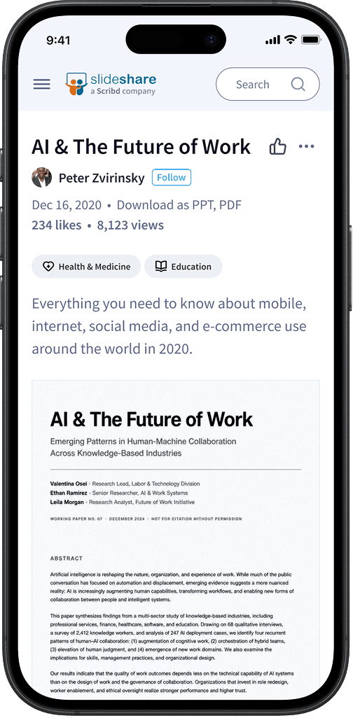
Fullscreen had become a patch for poor readability.
4 out of 7 users entered fullscreen to compensate for a reading space that felt too constrained.
Persistent metadata reduced cognitive load.
6 out of 7 users preferred the persistent layout. Keeping title, author, and ratings in place let them assess relevance without losing context.
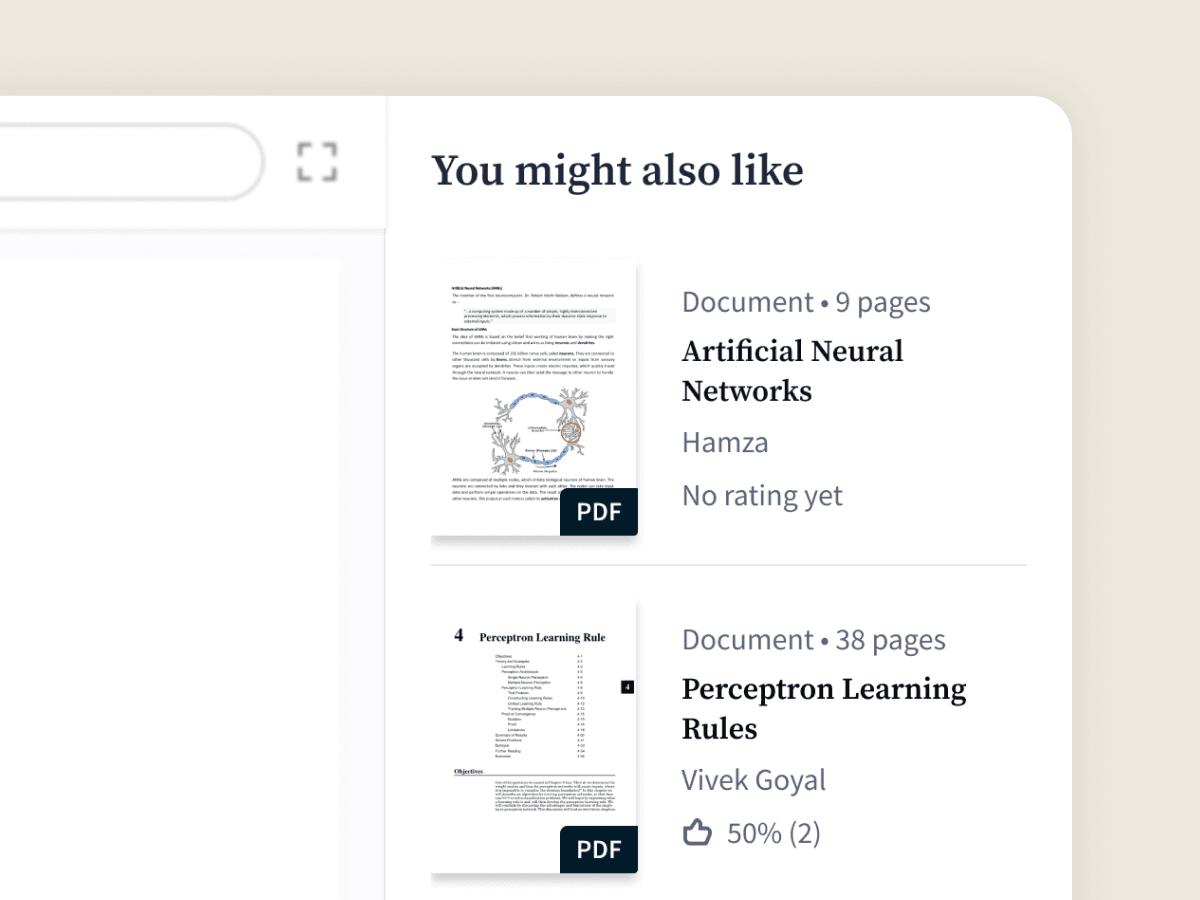
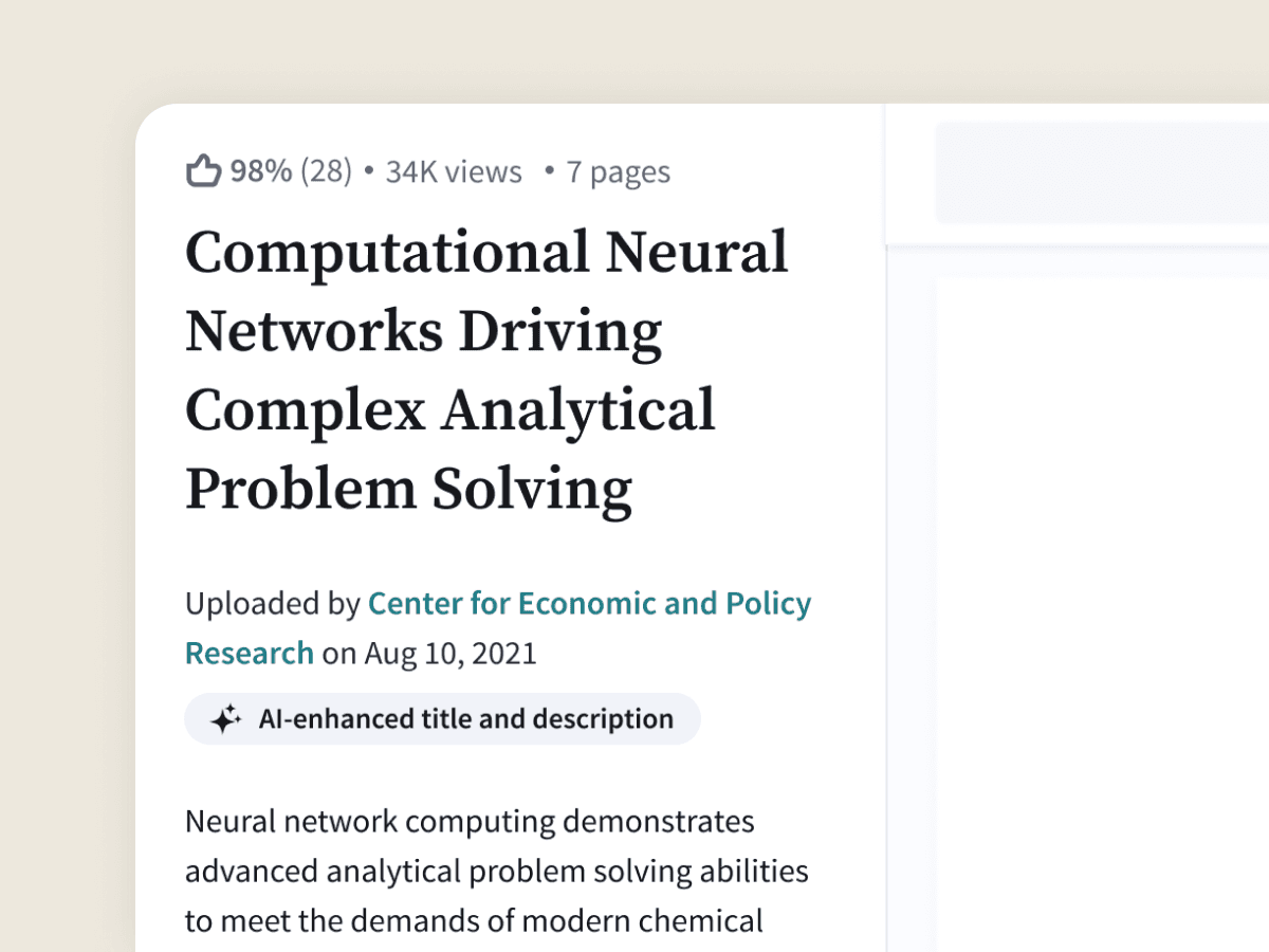
The recommendations competed with the document.
6 out of 7 users found recommendations distracting while reading. They wanted to see them after finishing the document, not alongside it.
Built for the quick scan and the deep read.
On arrival, metadata stays visible so users can evaluate the document without losing context. When they're ready to read, the document takes over: larger reading area, and a collapsible column that removes everything else from view.
Making room for ads without losing users in the process.
Ads and content need clear visual separation to coexist. The vertical format was the one advertisers valued most, and also the one that competed hardest with the reading area. I used the data to find the narrowest width that kept both sides of that equation working.